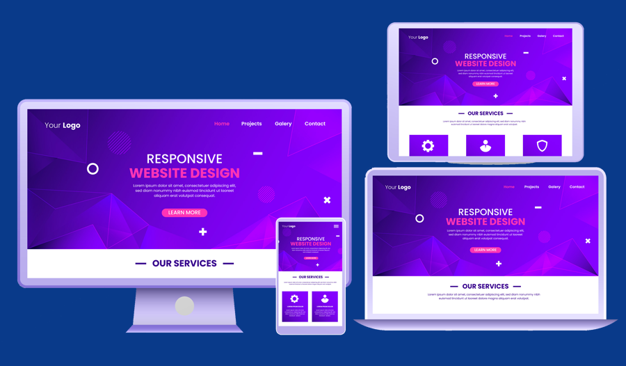
Responsive design is essential in today's digital landscape. With so many people accessing websites on their phones and tablets, it's more important than ever to make sure your website looks great on any device. One of the best tools for building responsive websites is Bootstrap, a popular front-end framework. In this article, we'll cover 10 essential tips for building responsive websites with Bootstrap, from understanding the grid system to optimizing images for mobile devices.
1. Use the Grid System:
Bootstrap's grid system is one of its most powerful features. It allows you to easily create responsive layouts by dividing your page into rows and columns. Make sure to use the appropriate classes for each device size (xs, sm, md, lg) to ensure your website looks great on all screen sizes.
2. Choose the Right Breakpoints:
Breakpoints are the points at which your website's layout changes to accommodate different screen sizes. Choose breakpoints carefully to ensure your website looks great on all devices. Consider using the default breakpoints provided by Bootstrap (xs, sm, md, lg), or creating your own custom breakpoints.
3. Optimize Images for Mobile:
Images can be one of the biggest culprits when it comes to slow-loading websites. Make sure to optimize your images for mobile devices by compressing them and using the appropriate file format (JPEG for photographs, PNG for graphics). You can also use the "img-responsive" class in Bootstrap to ensure your images scale properly on all devices.
4. Use Responsive Typography:
Typography is an important aspect of web design, and it's even more important in responsive design. Use a fluid font size that adjusts based on the screen size, and make sure to use the appropriate line height and spacing for each device size.
5. Keep Navigation Simple:
Navigation can be tricky in responsive design, but it's important to keep it simple. Use a hamburger menu for mobile devices, and make sure your navigation is easy to use and intuitive on all devices.
6. Use CSS Preprocessors:
CSS preprocessors like Sass and Less can be incredibly useful when working with Bootstrap. They allow you to write cleaner, more efficient code, and make it easier to create custom styles for your website.
7. Test on Multiple Devices:
Testing your website on multiple devices is essential to ensure it looks great on all screen sizes. Use tools like BrowserStack or Testize to test your website on a variety of devices and screen sizes.
8. Use Custom Fonts:
Bootstrap comes with a variety of fonts to choose from, but sometimes you may want to use a custom font. Make sure to use a web-safe font, or embed your custom font using @font-face.
9. Optimize for Page Speed:
Page speed is crucial for user experience, so make sure to optimize your website for speed. Use tools like GTmetrix or Google PageSpeed Insights to identify areas where your website can be optimized.
10. Use Flexbox:
Flexbox is a powerful CSS layout module that makes it easier to create complex layouts with fewer lines of code. Use it in conjunction with Bootstrap's grid system to create even more dynamic and responsive layouts.
Building responsive websites with Bootstrap can be a powerful tool for creating websites that look great on any device. By following these 10 essential tips, you can ensure your website is optimized for all screen sizes and devices. From using the grid system to optimizing images for mobile devices, these tips will help you create beautiful and functional websites that provide a great user experience. So go ahead and start building responsive websites with Bootstrap, and see the difference it can make for your website's performance and user engagement.
